BMW's new identity - More customer-centered
In its new brand identity, BMW stresses the customer-centric statement in all future activities. The black circle in the previous logo has been replaced, indicating the openness and transparency along with the brand's core values. In this fast-changing digital era, BMW wants to create diversity, flexibility, and novelty in each of its graphic designs.
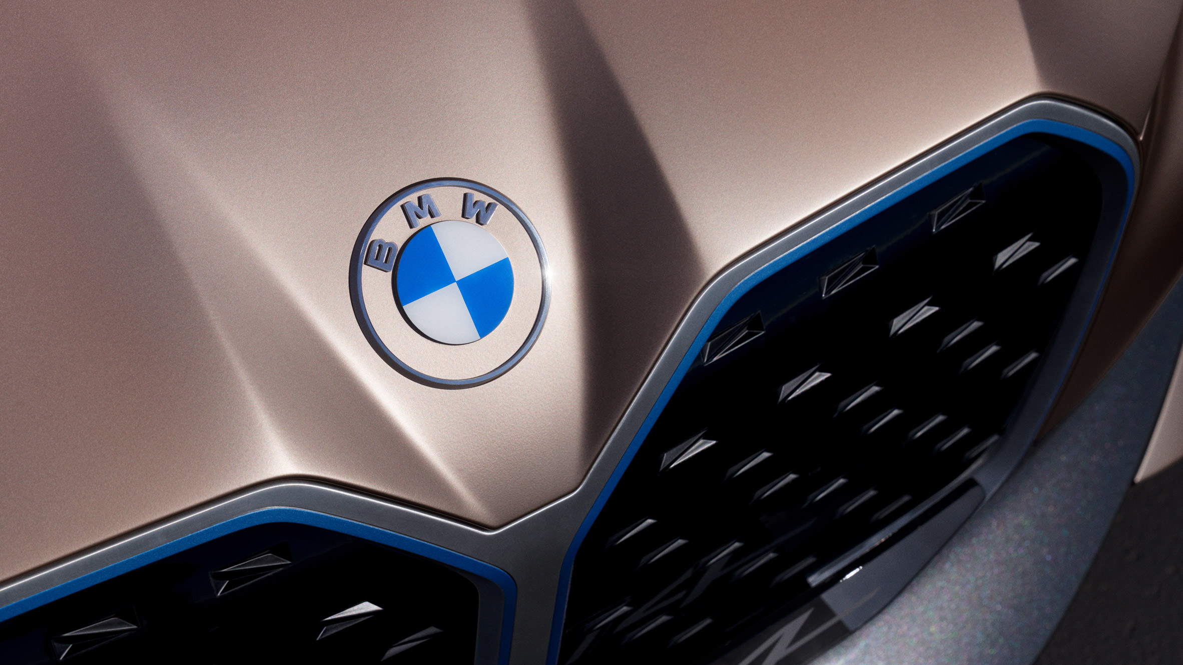
Compared to the previous logo, the new BMW logo has a flat and transparent surface which eliminates the black background in the outer circle, but maintains the Bavarian coat of arms colors and the three white letters B, M, W. The new logo also gives the viewers a sense of elegance, gentleness and elegance.

BMW's strong personality, open-mindedness and forward-looking spirit are also conveyed by the boldness in the logo's characters, creating a strong impression from reality to the online world.
The new brand identity once again confirms BMW's pioneering position in creating the passion of driving and its promise of sheer driving pleasure to each customer.